- Client
- Buy n Buy
- Industry
- Retail
- What we did
- Logo, identity system, brand application
- Line
- Better Choices. Greater Value.
The challenge
“Buy n Buy” is a name that repeats itself. The mark had to make that feel deliberate rather than accidental.
Retail brands live at every size at once — a shopfront from across a car park, a price label at arm’s length, a staff badge at conversational distance. A mark that only works large is not a retail mark.
The brand also needed to say something about why a shopper should choose it, not just what it is called.
What we did
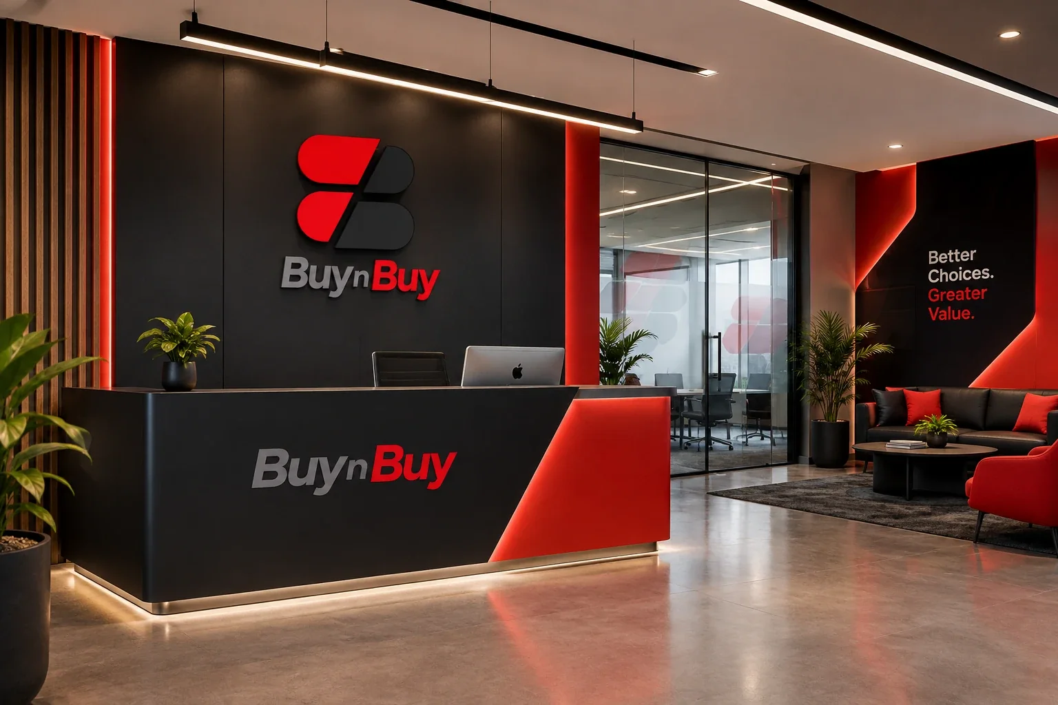
- Built the mark on the repetition, not around itA single B split down a diagonal — red on one side, black on the other. The name says “buy” twice; the mark answers with one letter doing it twice.
- Two colours, one cutRed for the offer, black for the weight behind it. No gradients, no third colour — the diagonal does all the work, which is why it survives being embroidered, printed at badge size and lit on a wall.
- Wrote a line the brand can stand behindBetter Choices. Greater Value. Two claims a retailer can actually be held to, carried through the reception wall, the ID reverse and the campaign work.
- Specified the applications, not just the logoSignage, uniform and staff ID were designed as part of the identity so the brand arrives complete rather than in pieces.
The system applied
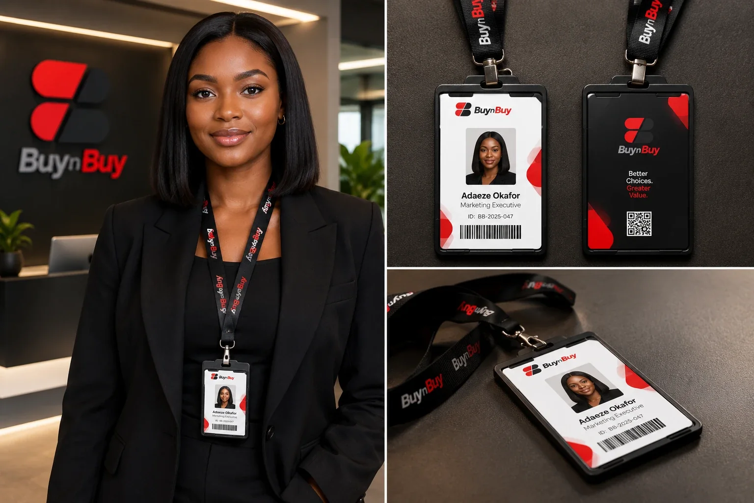
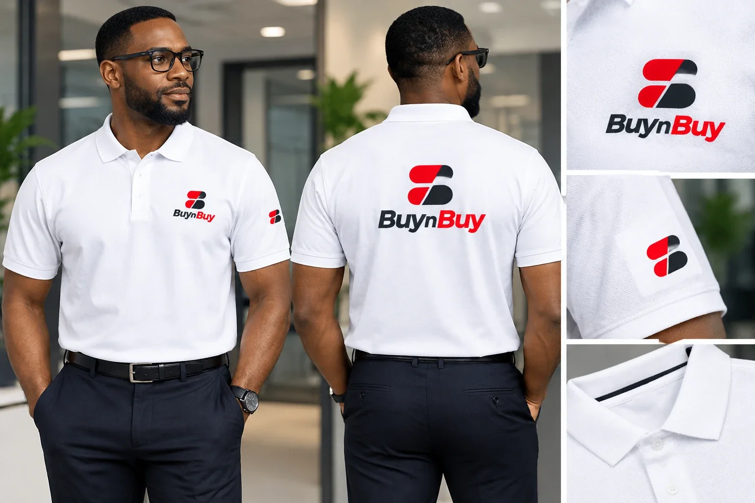
Application mockups from the brand presentation.
The outcome
A mark that reads at every distance a retailer needs, and a system the client can hand to a signmaker, an embroiderer or a print shop without us in the room. No trading figures on this page — those belong to the client.
What this involved